
Art direction, brand identity, packaging design
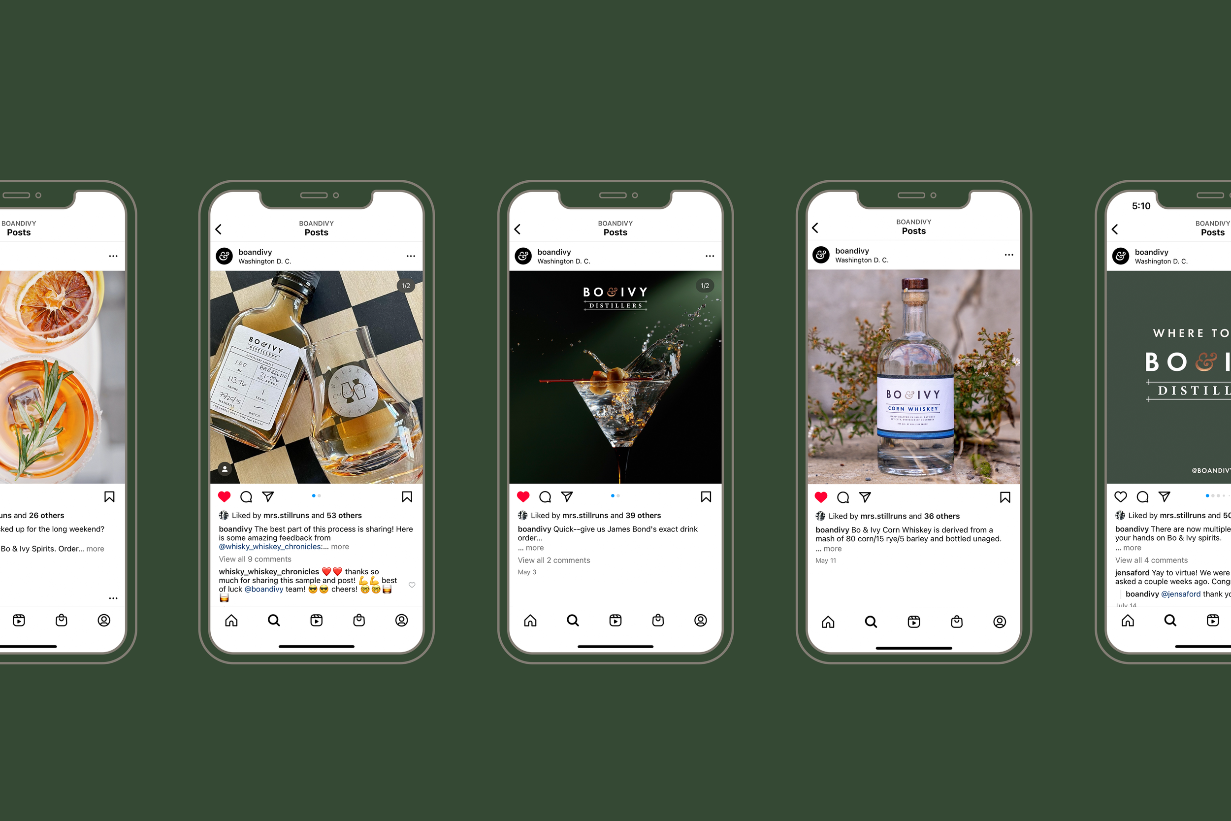
Bo & Ivy Distillers
Julia Fletcher was no newbie when it came to developing a brand — as someone with years of marketing experience as well as military service, she and her partners wanted to create an identity that emphasized the importance of carving your own path, and being damn good at what you do.


When it came to personality, I asked Julia to describe Bo & Ivy as a person. She said: if Rolex engineers and a motorcycle club got together for a garden party, they’d be drinking Bo & Ivy spirits. And at that moment, I knew I was going to fall in love with this brand.


Bo & Ivy’s roots are quite literally part of DC — the distillery is located on what used to be the B&O (Baltimore & Ohio) railroad, hence the “Bo.” Today, that neighborhood is called Ivy City, which plays directly into the name as well. And when Julia + team thought about the spirits they wanted to craft, they wanted to bring in two motifs: the masculine, industriousness of a railroad, with the ornate, lush and vibrant notion that comes with ivy.